Typography on my Floor

Tuesday, 28 May 2013


I rusted a piece of my steel typography signage without a protective floor covering and look what happened! Many would be horrified but I'm quite excited about the effect. I love having a typographical floor in my workshop!


Walking in Avebury

Monday, 23 July 2012


Our lives have been incredibly busy lately. A combination of this and a substandard internet connection have resulted in a forced stay-cation from Blogsville. However, I'm now back with a camera full of creativity just waiting to be uploaded...

Our work load over the last few months has been relentless. Mr Inky and myself are exhausted both physically and mentally from all the stuff we've had going on. More about that in another post...this one is all about a lovely, rejuvenating day out yesterday at the neolithic stone circle, Avebury.


We come here a lot as it's not too far from where we live. We don't profess to be druids but you really can feel a wondrous sense of calm and well being here even when there are masses of people (and sheep) wandering and wondering along side you. We come here when we are unsettled and facing change and the solid, ancientness of these stones seem to ground us.

The undulating landscape is lovely and very inspiring for an arty bod like myself. I love the colours in this picture...the yellow cornfield against the blue sky and green grass...


The stones form huge circles and inner circles which are enclosed by deep ditches and high, chalky banks which are great for running along, the only risk is sustaining an embarassing injury from slipping on a fresh sheep poo (there is rather a lot).

 
This path leads to a monumental collection of 'Lord of the Rings' type trees which were very mythical looking.


When we arrived there we saw a lady chanting a spell by one of the trees and a mother and son whispering words of prayer. We felt that we needed to be quiet and respectful here like when we visit a church or stately home. These beautiful trees certainly commanded the same respect. The ribbons hanging from the branches are peoples wishes...


Under the trees was a man playing the billabong. It was a welcome a soundtrack.


The little girl tied a ribbon onto one of the roots...


...and wished that she would grow fairy wings.


I wonder what these wishes are?


 This one is my secret, yellow wish..


Some wishes were more permanent...The, somewhat, raging Pagan in me tells me that this is tree abuse, the typographer, however, says it could be art...


...talking of art, these knarly roots are are a joy to behold, never ending, interlocking...


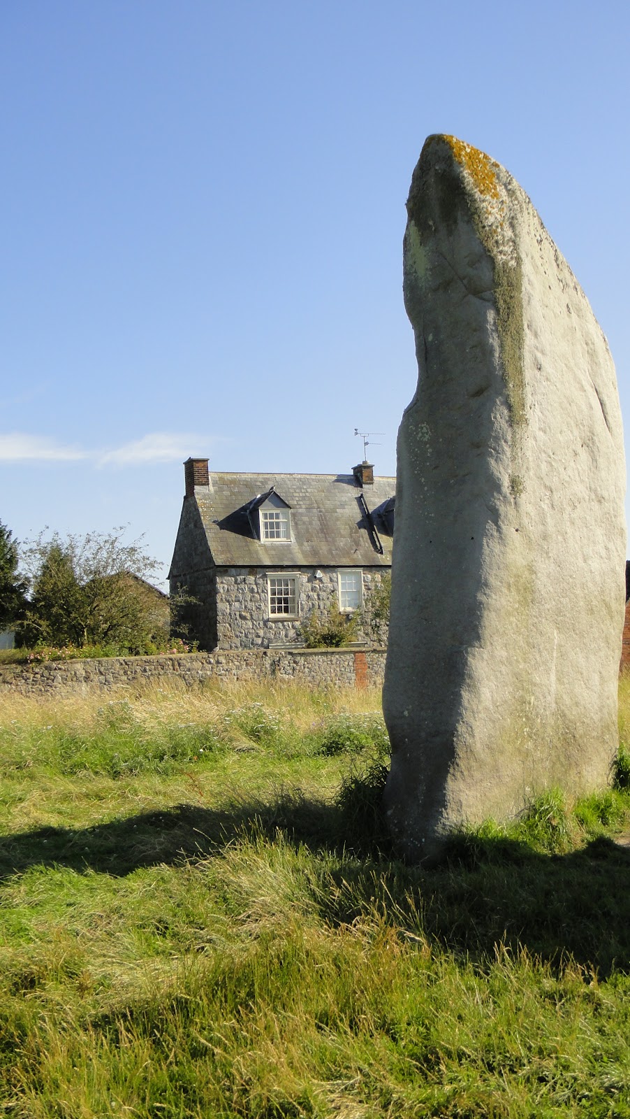
Imagine seeing huge, protruding stones when you open your bedroom curtains!


Not a rain cloud in sight... we enter another week fully refreshed!


Stone Lettering

Tuesday, 28 February 2012


I've always loved this quote and spent a long time last year drawing the lettering for this piece.

It kind of marks a turning point for me because for 10 years I've been drawing formal roman alphabets and consequently have become a bit obsessed with 'getting them right'. By 'right' I mean that the proportions of every letter are perfect, the space within and surrounding each letter is balanced etc.

Whilst I understand that it is essential to have strong foundations when developing a skilled craft, and the key to breaking the rules in art and craft is to know those rules inside out, it has left me with a slight nervous twitch every time I do something which bends formality a bit...will it look rubbish? Will my peers snigger at its childishness? Am I producing something new and exciting or odd and confusing? I think that this is quite common insecurity for arty, crafty bods.

I started to find that the longer I spent 'perfecting' something, the worse it starting to look!

My friend Judith helped me. She wondered why I was trying to recreate a perfect letterform. Was it because I was trying to make the letters look like they hadn't been hand drawn? Fine... if I had intended that but what was my intention? For me it is to create a beautifully formed letter, beautifully DRAWN, not typed on a computer. I realised that to me, the visual beauty in a letter created by a human hand (rather than a machine) is in its imperfections which, in turn, make that letter pleasing to the human eye.

...And so eventually, with a lot of messing about,  this lovely quote by William Morris became some thing beautiful for my house! The lettering is my variation on a roman capital. It's a bit wonky on purpose as I adjusted the letters to fit and didn't drawn any lines to follow which I think is interesting.

Finally, Judith said that I must look at the work of David Jones ...
 

A lot of his work was purchased by the Tate in the seventies. It's a beautiful and free exploration of roman lettering created, I think, with pen strokes like the 'versal' lettering used in ancient bibles and religious texts. Its imperfections are beautiful and very inspiring.

Not on the High Street

Saturday, 12 March 2011


I'm so excited because I applied to sell on notonthehighstreet.com last week. The first email they send you basically tells you not to get excited. Over 90% of applications are rejected and if you haven't heard in two weeks, you haven't made it. I sent them some pictures of my calligraphy stuff and a picture of the above...a 'stone canvas'. It's my 'whistle whistle...' calligraphy (see earlier post), carved in stone then photographed and printed onto canvas. I'm so excited about it because I think it looks really effective...it really gives the illusion that it is stone. So I took loads of pictures, wrote my ideas down in a carefully worded email (which took half a day to write....)


...and I waited...and obsessively checked my email every hour.


And then it came..they said they 'loved my range'...how exciting!!!!

(Thank for the BRILLIANT card, Lally!)

Whistle Stone

Thursday, 24 February 2011


I was so delighted to pick up my 'whistle, whistle..' quote today from Judith's workshop. As you can see from the pictures, it started as a piece of calligraphy which I chopped up for the layout then photocopied. Martin then cut it beautifully onto an off-cut of stone. I wrote two pieces; one using lines and one without. This is the one without and both Judith and I agreed it was much more appropriate to the nature of the text..it was 'free', like the little bird. This piece is an experiment and will be put on to canvas and made into a print...so watch this space!

Wild Ink All rights reserved © Blog Milk - Powered by Blogger